Visualizing COVID
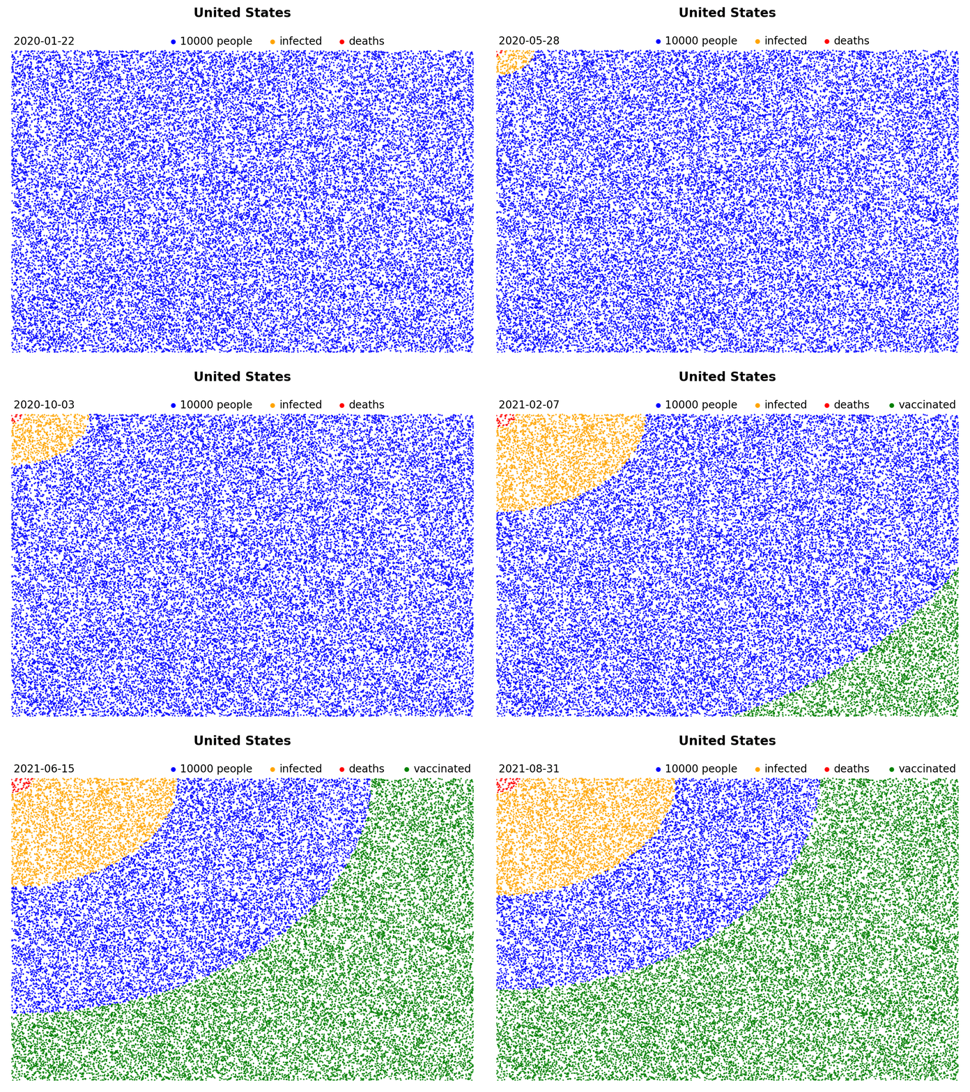
“2 million people died of COVID” or “The US has surpassed 25 million cases” - Despite the fact that more people die from COVID every day than died on 9/11, these numbers just don’t seem to make the impression anymore like they did at the beginning of the pandemic. I made these animations to put these numbers into perspective, and to try and wrap my head around them. If you’re interested in making your own, I share the code below.
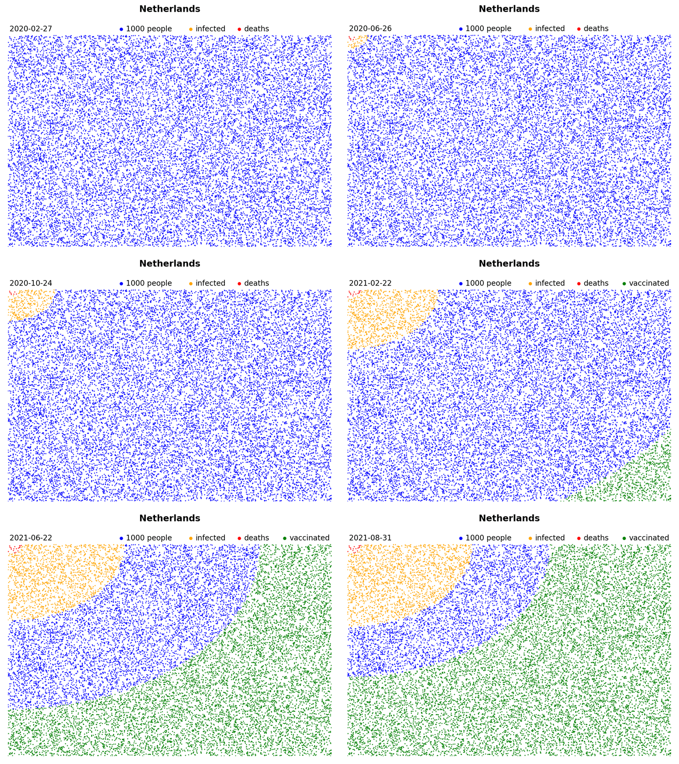
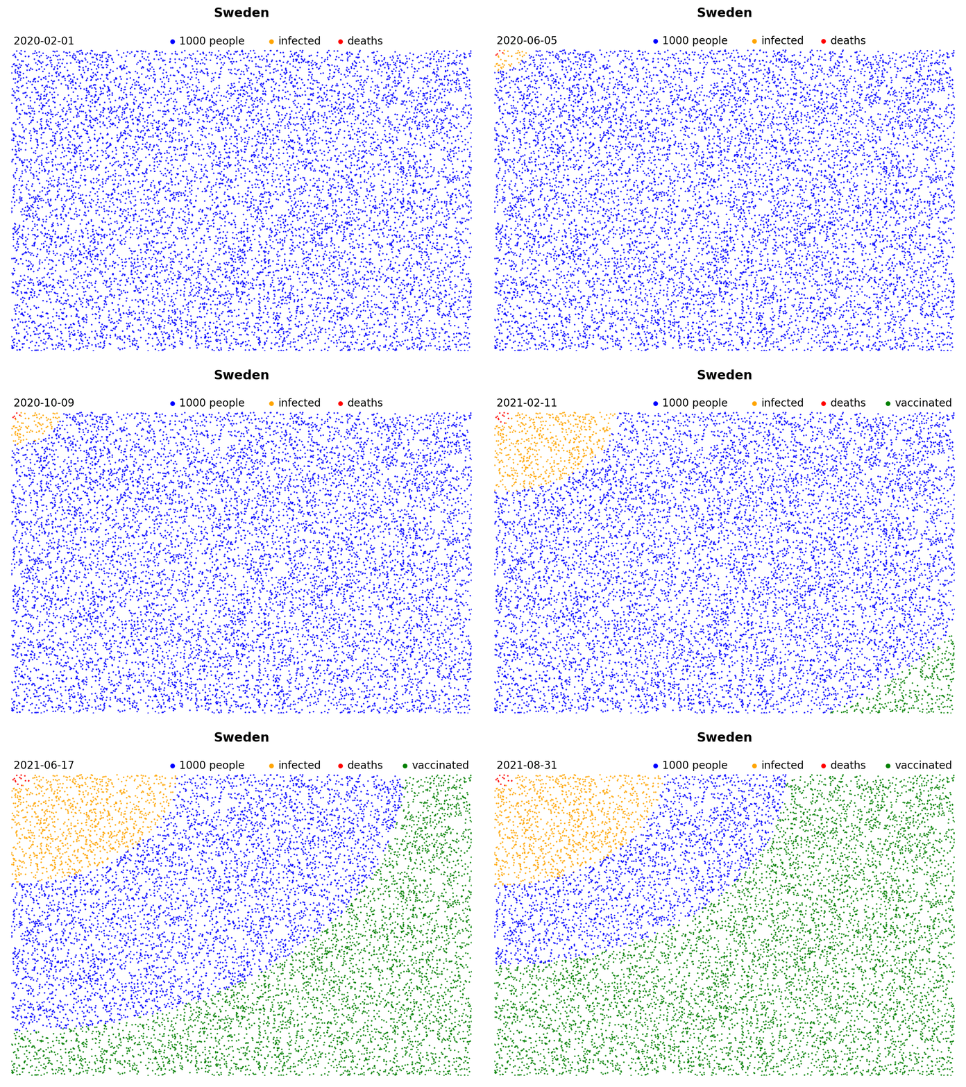
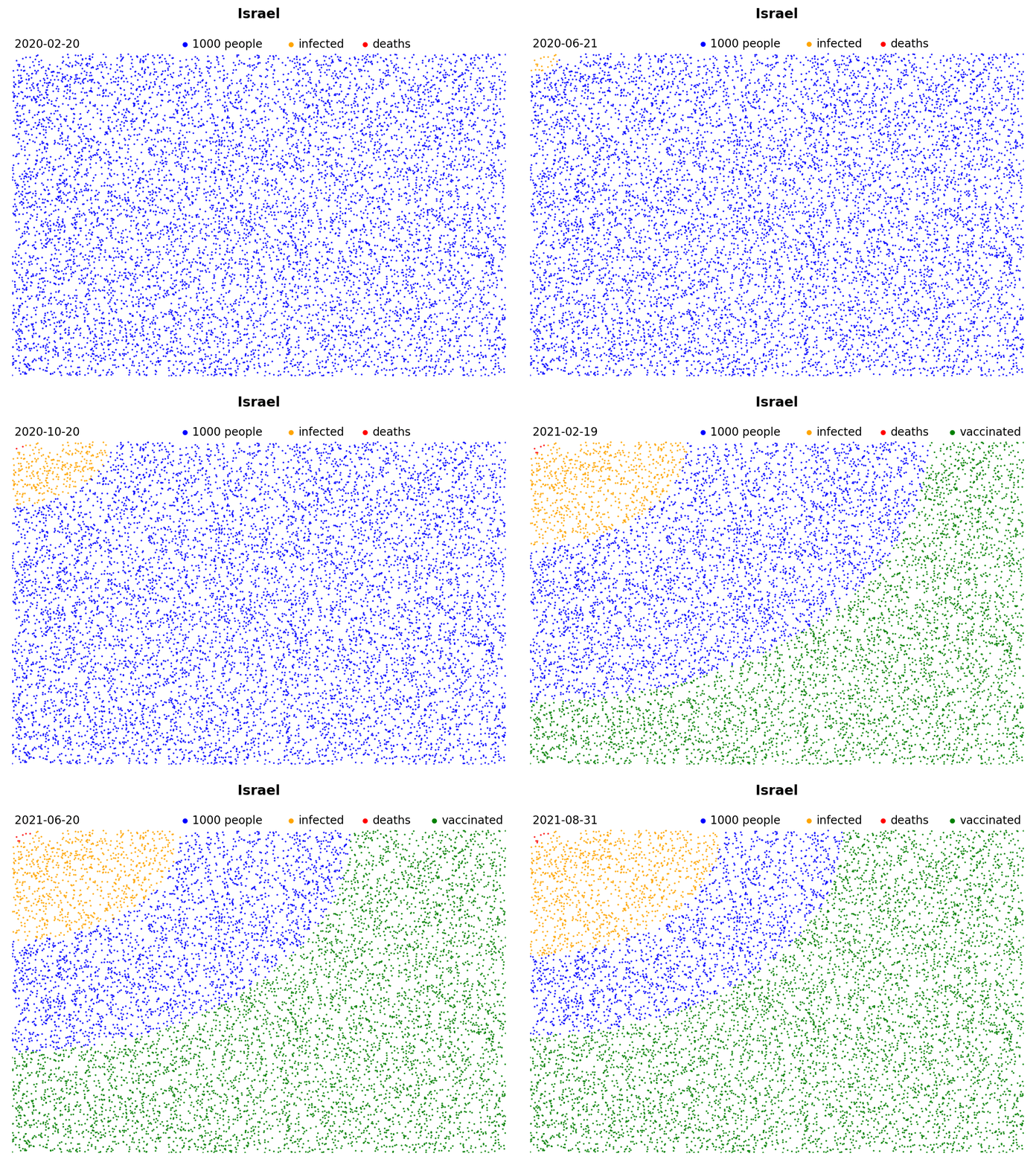
These blue squares represent the entire population of a country. Every blue dot stands for a certain number of people. Every orange dot represents that same number of people after they are infected with COVID, while the red dots refer to the COVID death toll.

This is my home country, The Netherlands:

Sweden, another country that was heavily hit:

And check out the amazing vaccination effort in Israel:

You can make your own visualizations like these from any country using the Python code described below. The only libraries you’ll need are Matplotlib, Numpy, & Pandas. To make the final visualization you’ll need to have some library installed to make either a GIF or a video. On my system (Ubuntu) I use FFmpeg, but you might have Pillow installed by default with Python or use ImageMagick, alternatively.
We start with importing the libraries:
import matplotlib.pyplot as plt
import matplotlib.animation as animation
from matplotlib import rc
import numpy as np
import pandas as pd
rc('animation', html='html5')
Data for this project was pulled from Our World in Data. Specifically, I pulled their daily-updated COVID dataset like so:
data_path = 'https://covid.ourworldindata.org/data/owid-covid-data.xlsx'
data = pd.read_excel(data_path, engine='openpyxl')
You should totally have a look at this amazing dataset. I’ve been using it since the beginning of the pandemic. It contains not only country-specific data about COVID cases and deaths, but also lots of general information about each country. Recently, vaccinations (both doses as well as total vaccinated people) were included.
Next we select the country of choice from the data and replace NaN values with 0:
target = 'Netherlands' # Note that you have to do proper capitalization
data = data[data.location==target].fillna(0)
We make the variables that will control the X and Y coordinates as well as the color of the dots. We pick random X and Y coordinates, but then we sort the dots by their distance to the top-left corner:
# Total dots
factor = 1000 # The number of people that will be represented by one dot
total = int(data.population.iloc[0]/factor)
X = np.random.rand(total)
Y = np.random.rand(total)

# Pythagoras to calculate the distance to the top-left corner
sorter = np.argsort(np.sqrt(X**2 + (1-Y)**2))
X = X[sorter]
Y = Y[sorter]

# Colors (they're all blue to start with)
colors = ['blue'] * total
Here we make the figure and the actual scatter plot:
fig, ax = plt.subplots(1)
fig.suptitle(target, fontsize=12, fontweight='bold')

# This is the actual scatter
vis = ax.scatter(x=X, y=Y, c=colors, s=0.2)
ax.set_xlim([-0, 1.0]); ax.set_ylim([-0, 1.05])
text = ax.annotate(data.date.iloc[0], [0.005, 1.02])
plt.axis('off')
Matplotlib has a built-in function for animations called ‘animation’, which is what we’ll use. But first we’ll have to make the function that is actually responsible for updating the data. Note that the input of this function is the frame number ‘i’ while the output consists of all the updated artists. We pass ‘i’ to the DataFrame with our country data to grab the data in the right sequence. This only works because the original dataset is sorted by date. If this is not the case in your situation, you’ll have to sort the data first using ‘sort_values’:
def updater(i):

	# Grab the data
	date = data.date.iloc[i]
	deaths = data.total_deaths.iloc[i]
	cases = data.total_cases.iloc[i]

	# I use the column 'people_vaccinated', but you can also use
	# 'people_fully_vaccinated' to only include people that received
	# 2 doses.
	vaccinated = data.people_vaccinated.iloc[i]

	# Change the text to the current date
	text.set_text(date)

	# Change the color of the dots
	for j in range(int(cases/factor)):
		colors[j] = 'orange'
	for j in range(int(deaths/factor)):
		colors[j] = 'red'

	# Vaccinations will start from the other direction
	stop = int(vaccinated/factor)
	if stop == np.nan: stop = 0
	for j in range(total-1, total-stop, -1):
		colors[j] = 'green'

	# Update the colors of the scatter plot
	vis.set_color(colors)

	return vis, text,
Finally, we do the actual animating. This is done using the animate module of Matplotlib:
ani = animation.FuncAnimation(fig, updater, frames = range(len(data)),\
 interval = 10, repeat = False, blit = True)
We use the save method to save to a GIF (the method will understand that from the file extension). This method will probably automatically grab whatever library you have installed on your system to make the GIF (e.g., FFmpeg or Pillow), however you can also specify one using ‘writer’ argument (e.g., writer=’imagemagick’):
ani.save(f'./{target}.gif', fps = 10)
Alternatively, you can plot directly instead of saving to a GIF:
plt.show()